the same quiet tile system, but filtered through design principles and css takeaways.
Each tile points to a snippet when there is one. Open the demo if you want to edit the code, or jump to Laws of UX for the source principle.
8 entries.
Aesthetic-Usability Effect
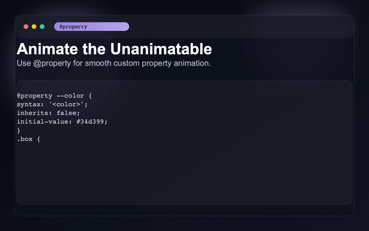
Use design tokens (CSS custom properties) for color, type scale, and spacing so the UI feels consistent and polished. Consistency reads as quality.
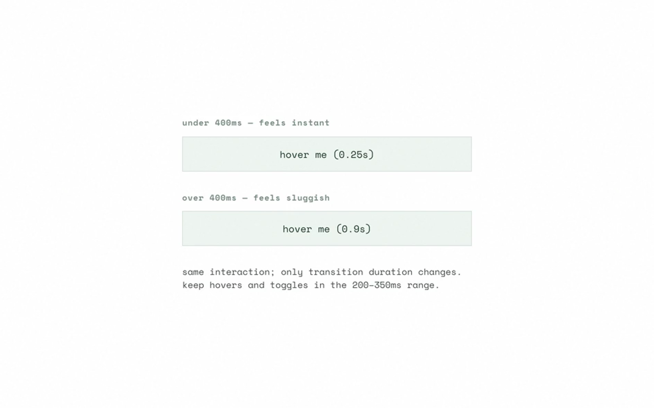
Doherty Threshold
Keep transition and animation duration under ~300–400ms for hover, focus, and toggle feedback so the system feels responsive.
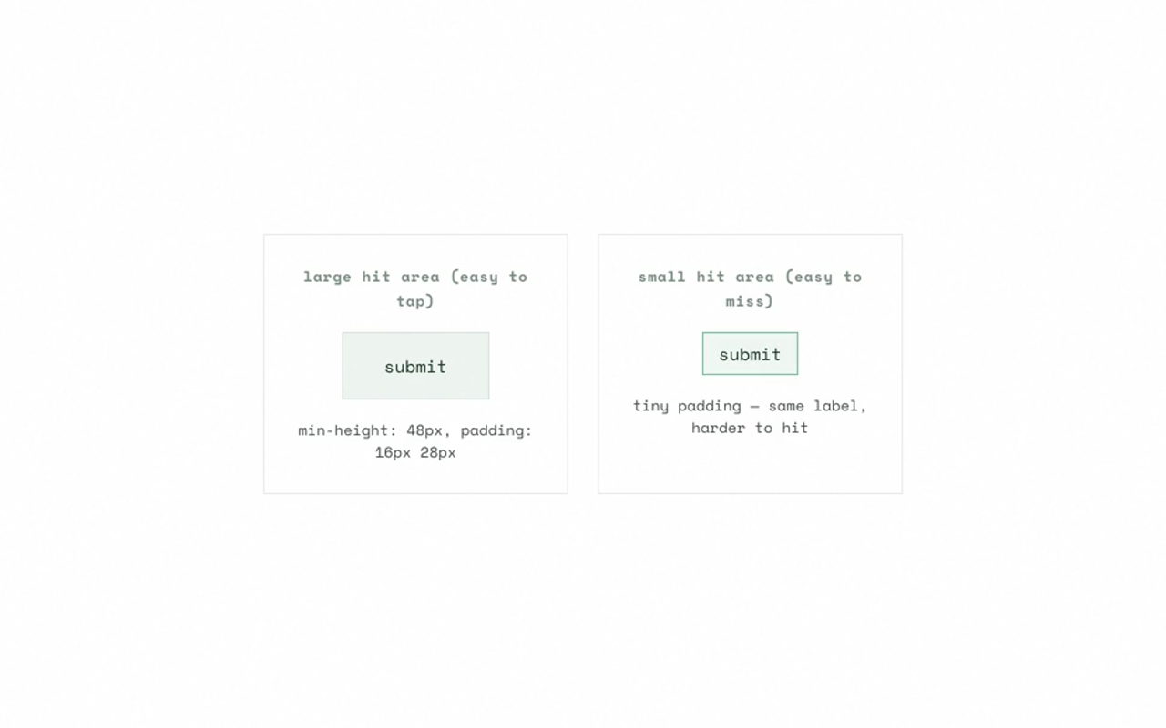
Fitts's Law
Use min-height/min-width (e.g. 44px for touch), padding to grow hit area without changing visual size, and gap to separate targets.
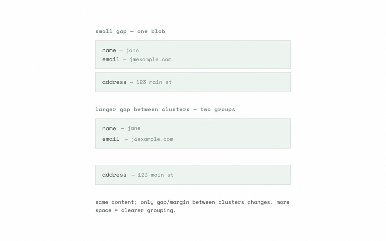
Law of Proximity
Use gap in flex/grid and margin to group related elements and separate groups. Spacing encodes hierarchy.
Law of Common Region
Use background, border, border-radius, or box-shadow to create regions (cards, sections, modals) so grouping is obvious.
Miller's Law (Chunking)
Chunk with layout: use grid/flex + gap and borders or backgrounds to create 5–9 clear chunks (e.g. form sections, list groups).
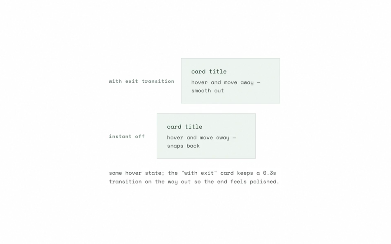
Peak-End Rule
Add a short transition on exit (e.g. transition on state change) so the end of an interaction feels intentional, not abrupt.
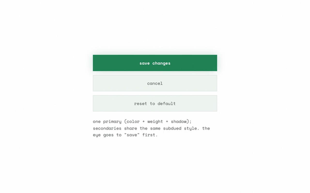
Von Restorff Effect
Style the primary CTA with contrast (color, font-weight, size, box-shadow); keep secondary actions visually similar.