Boxing the Digital Canvas: I Love PDFs
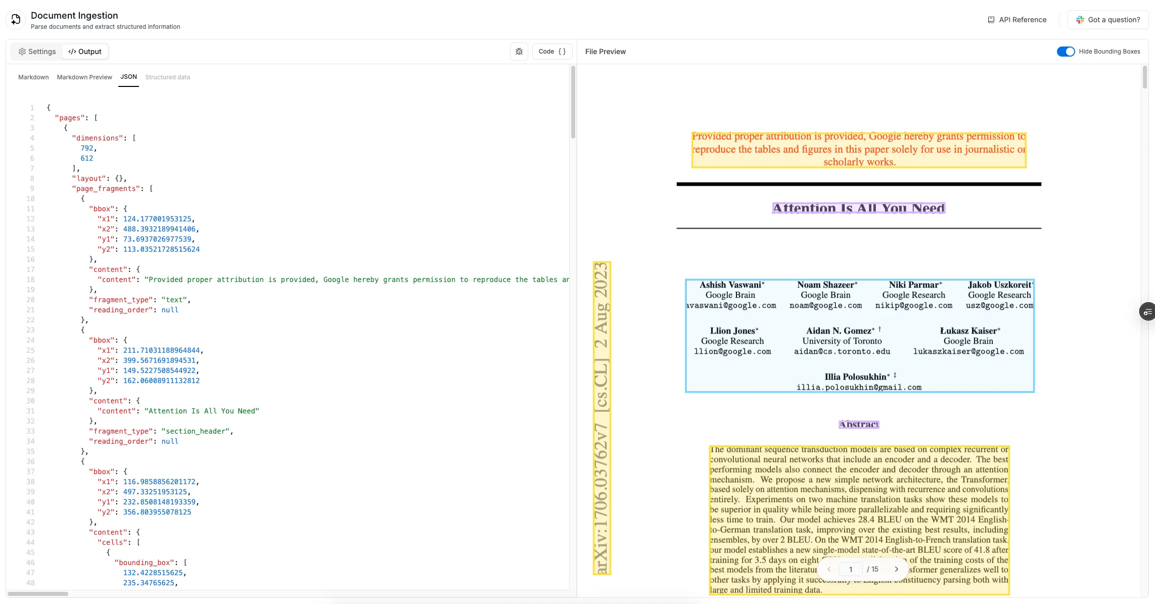
In today’s era, data is THE commodity. PDFs, still the backbone of business documentation, hide valuable data in plain sight. At Tensorlake, our backend OCR services extract data, generating precise coordinates for every text block, table, form field or any other fragment types for that matter. But raw coordinates mean nothing without visualization. So I built this React component for PDF viewer (we use https://github.com/anaralabs/lector for rendering our PDFs) that bridged the gap of showing the boxes from JSON data coordinates and the UI
The Problem
When working with document processing systems, we often need to visualize various elements identified by machine learning models - tables, text blocks, headers, signatures, and more. These elements need to be:
- Visually distinct based on their type (different color boxes)
- Properly scaled and positioned over the original document (and they had to be responsive)
- Interactive, allowing users to hover and see details
The UI Design for this was done by my dear friend @pseudonymtra
Meet the BoundingBoxRenderer
The BoundingBoxRenderer component is designed to overlay bounding boxes on top of PDFs and images. It handles the complexities of scaling, positioning, and rendering boxes with different styles based on element types.
Here’s the component signature:
interface BoundingBoxRendererProps {
  type: 'image' | 'pdf';
  rects: HighlightRectData[];
  onFragmentClick?: (rect: HighlightRectData) => void;
}

export function BoundingBoxRenderer(props: BoundingBoxRendererProps): ReactElement {
    const containerRef = useRef<HTMLDivElement>(null);
    const [scale, setScale] = useState({ x: 1, y: 1 });
    const [imageSize, setImageSize] = useState({ width: 0, height: 0 });

    // Image-specific scaling effect
    useEffect(() => {
      if (props.type !== 'image') return;

      // Logic to calculate scaling factors between natural image dimensions and displayed dimensions
    }, [props.type]);

    // Main rendering effect
    useEffect(() => {
      if (props.type === 'image') {
        // Render bounding boxes for images
      } else {
        // Render bounding boxes for PDFs
      }

      // Cleanup function
      return () => {
        // Remove containers when component unmounts
      };
    }, [props.rects, props.type, scale, imageSize, props.onFragmentClick]);

    // Conditional rendering based on type
    if (props.type === 'image') {
      return <div ref={containerRef} className="absolute inset-0 pointer-events-none" />;
    }

    return <div className="hidden" />;
  }
The component takes three key props:
type: Whether we’re annotating a PDF or an imagerects: An array of rectangle data to renderonFragmentClick: Optional callback for when a user clicks a box
Handling Images vs PDFs
One of the most interesting aspects of this component is how it handles the different challenges of annotating images versus PDFs.
For Images
With images, the main challenge is scaling. When an image is rendered in a browser, its display size often differs from its natural dimensions. Our component needs to calculate the correct scaling factors:
// Image-specific scaling effect
useEffect(() => {
  if (props.type !== 'image') return;

  const calculateScale = () => {
    const container = containerRef.current;
    if (!container) return;
    const imageElement = container.parentElement?.previousElementSibling as HTMLImageElement;

    // Calculate scaling factors between natural image size and rendered size
    setScale({
      x: rect.width / imageElement.naturalWidth,
      y: rect.height / imageElement.naturalHeight
    });
  };

  // Set up listeners to recalculate on resize and image load
  calculateScale();
  window.addEventListener('resize', calculateScale);
}, [props.type]);
For PDFs
PDF rendering is handled differently. Instead of a single container, we create separate containers for each page:
// PDF BB rendering logic
document.querySelectorAll('.tensorlake-bbox-container').forEach(el => el.remove());

// Group rectangles by page number
const rectsByPage = props.rects.reduce((acc, rect) => {
  acc[rect.pageNumber] = acc[rect.pageNumber] || [];
  acc[rect.pageNumber].push(rect);
  return acc;
}, {} as Record<number, HighlightRectData[]>);

// Create a container for each page and add the boxes
Object.entries(rectsByPage).forEach(([pageNum, pageRects]) => {
  const pageElement = document.querySelector(`[data-page-number="${pageNum}"]`) as HTMLElement;
});
The Magic of Colorful Boxes
The visual appeal of our component comes from the variety of colors and styles applied to different element types. This is handled by utility functions that determine the appropriate styling:
export const getColorByType = (type: string): ColorResult => {
  switch (type) {
    case 'section_header':
      return {
        background: 'rgba(216, 180, 254, 0.3)',
        border: 'rgba(216, 180, 254, 1)',
      };
    case 'table':
      return {
        background: 'rgba(125, 211, 252, 0.1)',
        border: 'rgba(125, 211, 252, 1)',
      };
    // More cases depending on the fragment_type you wanna show
  }
};
Creating Interactive Highlight Boxes
The heart of our component is the createHighlightBox function, which generates a DOM element for each bounding box. Here’s a simplified view of what it does:
function createHighlightBox(rect, position, onFragmentClick) {
  // Create the box element
  const box = document.createElement('div');

  // Position it correctly
  box.style.left = `${position.left}px`;
  box.style.top = `${position.top}px`;
  box.style.width = `${position.width}px`;
  box.style.height = `${position.height}px`;

  // Style it based on fragment type
  box.style.backgroundColor = getColorByType(rect.fragmentType).background;
  box.style.borderColor = getColorByType(rect.fragmentType).border;

  // You can choose to add hover effects and click handlers

  return box;
}
Behind the scenes, this function:
- Creates a div element for each box
- Positions it absolutely based on the calculated coordinates
- Applies styling based on the element type
- Adds hover effects that show a label and highlight the box
- Attaches click handlers for interactivity
Z-Index Management
An often overlooked aspect of overlaying multiple elements is managing z-index to control which elements appear on top. Our component handles this with a utility function:
export const getZIndexByType = (type: string): number => {
  switch (type) {
    case 'text':
      return 5;
    case 'table':
      return 10;
    // More cases...
    default:
      return 1;
  }
};
This ensures that certain element types (like section headers) always appear above others (like regular text), creating a more user-friendly visual hierarchy
The Final Touch: Hover Effects
What makes our component truly interactive is the hover effect. When a user hovers over a box, several things happen:
- The background opacity changes
- A shadow appears around the box
- A label showing the element type pops up
- The z-index temporarily increases to bring it to the front
All of this creates a responsive interface for exploring the document structure
Putting It All Together
To use this component in your app, you would typically:
- Parse your document to identify elements and their bounding boxes
- Convert those into the
HighlightRectDataformat - Render the component alongside your PDF or image viewer
function DocumentViewer({ documentUrl }) {
  const [rects, setRects] = useState([]);

  // Fetch and process document data
  useEffect(() => {
    async function loadDocumentData() {
      const result = await fetchDocumentAnalysis(documentUrl);
      setRects(convertJsonToImageRects(result).rects);
    }
    loadDocumentData();
  }, [documentUrl]);

  return (
    <div className="document-container">
      <PDFViewer url={documentUrl} />
      // We also used a CustomLayer component exposed by the viewer library to render the boxes inside of it
      <BoundingBoxRenderer
        type="pdf"
        rects={rects}
        onFragmentClick={(rect) => console.log('Clicked:', rect)}
      />
    </div>
  );
}
Conclusion
The BoundingBoxRenderer component demonstrates how you can enhance document viewing experiences by adding interactive visual layers on top of PDFs and images. By handling the complexities of positioning, scaling, and styling, it allows developers to focus on the document content rather than rendering details.
Whether you’re building document analysis tools, creating annotation systems, or just trying to make document viewing more insightful, the techniques shown here provide a good head-start.
Next time you look at a PDF, think about the hidden structure within it, waiting to be boxed, colored, and brought to life on your screen :)
Huge shoutout to @andrewdorobantu for developing the PDF Viewer library